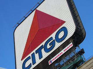
This is a picture I took in Boston of the Citgo sign. I like that parts of the sign are cut off which makes if feel like the sign is a lot closer. I also enjoy the fact that you can see a lot of detail like the lines which you can't usually see as clearly in most pictures of the sign.
1 comment:
the cut-off portions and the unusual angle add interest, but the fact that the "c" in citgo is a bit annoying. if the photo cut off that corner but left the c intact, that would be great.
Post a Comment