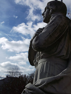
I took these photos a few weeks ago on the side of the school. I liked how the light brought out the features in the statues. I like the angle of the top photo better because you can see more of the statue, but I thought that the trees and the powerlines were very distracting. So I took the bottom photo at a lower angle to get rid of them, but I still like the top photo more because more of the statue is visible.

2 comments:
I really like the angle of this photo. I think it was creative rather than the straight on picture most people would take. I agree with you that the top one is more visible and has more light but i like the second one better because it is focused on just on part of the statue rather than the whole thing. lastly, i love the way all of the lines and cracks are accented with the light coming in from the side
I like both of these photos a lot. You took it at a good time of day because there was enough light for a good photo, but it wasn't to bright. I like how in focus the clouds and the statue are. I like the second photo better because you took it at a more interesting angle and the background is less distracting. I do agree the lighting is better in the first one though.
Post a Comment