Monday, February 27
Yulu_Person/Place/Thing
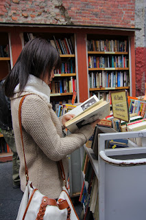
This is my PPT photos, the first picture is a girl stand in book store, she is reading book. the second one is shows the place,the book store. And the last one is shows a sunny day,the building is behind the book store.And the book store is on the corner,because of the sunny day, the book keeper would be sale the books.
Subscribe to:
Post Comments (Atom)


3 comments:
All three photos are clear and very well focused. In the second photo, the upper left corner is way too underexposed but the rest is fine.
I like the building with cloud picture. this is unique and great shadow. this photo is great focus of the building.
I like the middle photo, with the book sale. the brick walls are very complicated and engaging to look at, which complements the book sale nicely. I can't help but feel that the overexposed upper-left corner is a little distracting, though. I think that if it was cropped out, the viewer could see more of the detail in the books and the bricks, which would be good.
Post a Comment